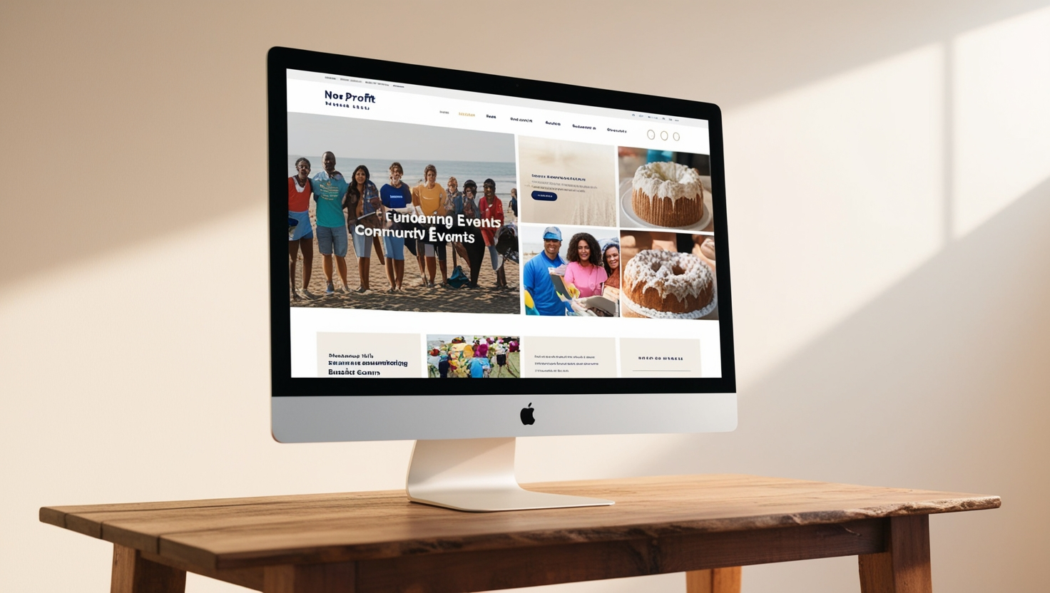
A New Digital Dawn for a Canadian Non-Profit Foundation: Navigating Impactful Change with User-Centric Design
We redefined and improved the user journey of the website of a Non-Profit Organization in western Ontario.
Introduction
In a world where online presence is crucial for engagement and outreach, a Canadian non-profit foundation faced challenges in creating an intuitive, user-friendly digital space that effectively communicated its mission. The organisation sought to enhance its website’s UI and navigation to streamline user journeys and boost engagement with its various audiences. Voyantt’s UI/UX team took on this mission, crafting a comprehensive, convincing, and efficient prototype using Figma. This case study explores how our design expertise transformed the foundation’s digital landscape, enabling it to connect more profoundly with its owners, volunteers and benefactors.
The Challenge
The Non-Profit-Organisation’s existing website was outdated, with a confusing layout and convoluted navigation that hindered user engagement. Visitors found it difficult to access crucial information, and the lack of a coherent user journey led to decreased interaction with important resources and donation opportunities. The challenge was clear: the foundation needed a website that not only looked modern and inviting but also guided users effortlessly through the site to achieve their goals, whether that be learning about initiatives, signing up for events, or making a donation.
Our Solution
Recognizing the need for a fresh and strategic approach, Voyantt’s UI/UX team set out to completely revamp the foundation’s digital experience. We began by conducting an in-depth analysis of the existing website, gathering insights from user feedback, and identifying key pain points in the user journey. This research phase was critical in understanding the unique needs of the foundation’s diverse audience, which included volunteers, donors, and beneficiaries.
Armed with this knowledge, we moved into the design phase using Figma, a powerful tool for creating interactive prototypes. Our focus was on creating a visually cohesive and easy-to-navigate website that would enhance user experience and encourage engagement. We designed a streamlined navigation system, ensuring that users could easily find the information they were looking for without unnecessary clicks. We also incorporated a more intuitive layout, highlighting key actions such as donations and event registrations prominently to drive user engagement.
Our prototype was designed with user experience as a top priority. We conducted extensive testing with real users to gather valuable feedback and refine the design accordingly. By incorporating user insights, we were able to create a prototype that was not only visually appealing but also highly functional and met all organizational expectations. The final product is a testament to our commitment to user-centered design
Results and Impact
The Canadian foundation has successfully transformed its digital presence through a user-centered pathway, resulting in increased visitor satisfaction and improved interaction rates. The streamlined navigation and intuitive design of the website prototype have helped users quickly find relevant information, related to services, events and donations. This led to a notable increase in event sign-ups and donations. This project demonstrates the power of strategic UI/UX design in elevating an organization’s digital presence and driving impactful change.
Conclusion
Our commitment goes further than just solutions. We continuously monitor and optimize the system to adapt to the agency’s evolving needs. We leverage client feedback and the latest technologies to deliver innovative, future-proof solutions that bring significant value to their operations. This project exemplifies how automation can revolutionize tedious tasks, empowering businesses to focus on what matters most – their people and their success.
